Understanding columns
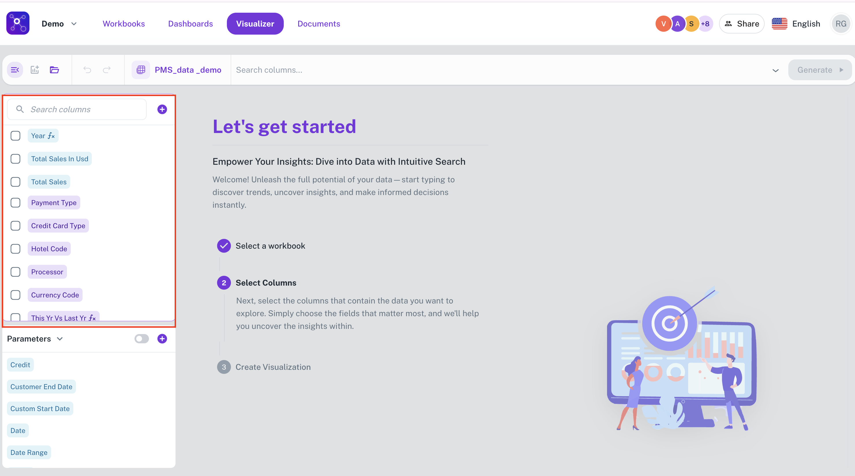
Once the workbook is selected, the next step is to identify and add the desired columns to be visualized. All the columns of the workbook are listed in the left navigation panel. The columns are listed with color codes:
-
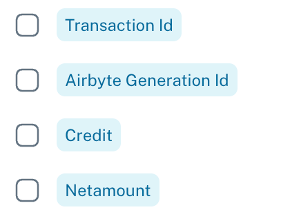
Blue: These columns contain numerical data that can be aggregated by summing their values.
-
Purple: These columns contain data, either numerical or textual, that are not suitable for summation or similar mathematical aggregation.

-
Grey: These columns contain date and time-based data.

You can select these columns from the left navigation panel, which populates these columns on the Search bar
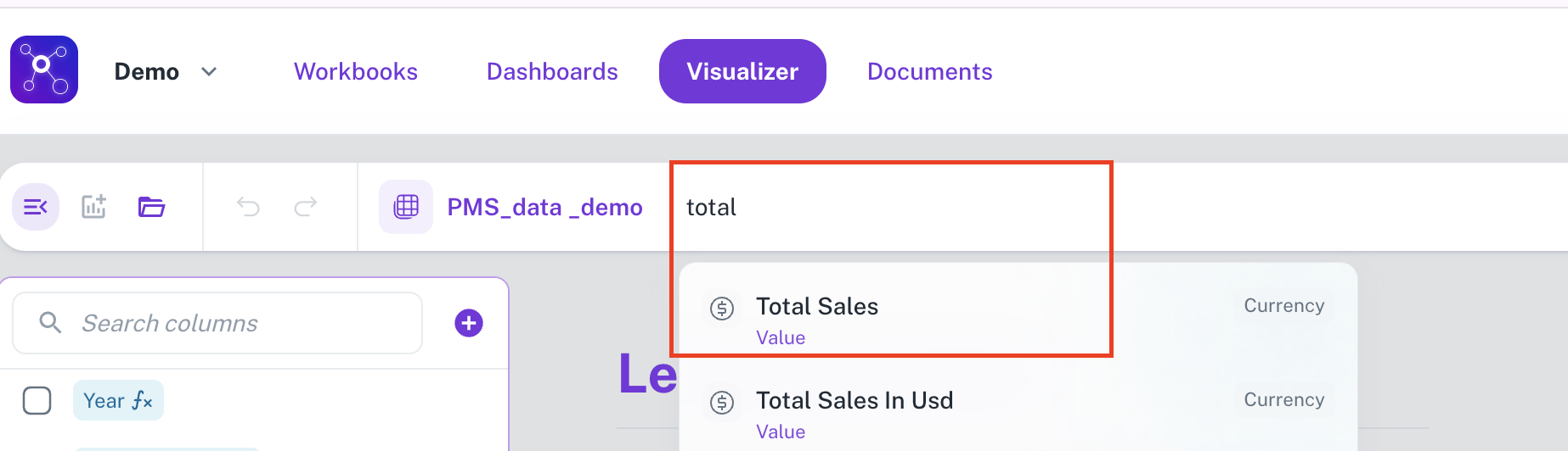
Another method to select columns is by typing the column name on the search bar, this would show a drop down on suitable columns in auto complete mode.
The next step is to choose the appropriate aggregation functions for each column. Refer to Aggregate functions for more details.
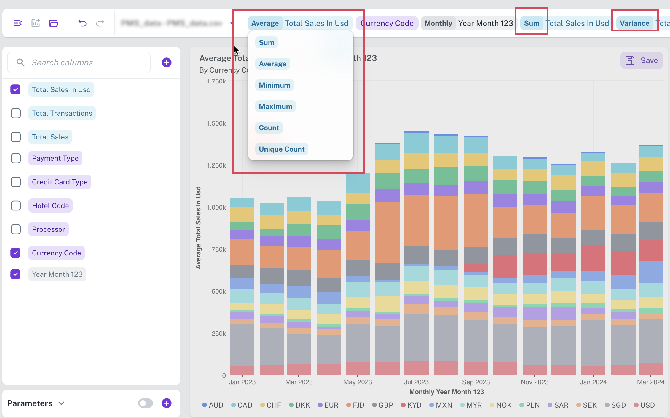
You can click Create Now or from top click Generate. The most appropriate visualization widget for your selected data is displayed on the canvas.
Was this helpful?