Pivot table widget
Configuring Pivot table widget - configuration and setting
To configure PivotTable widget do the following:
-
From the right side of the widget generation page, click the Update Widget Column Configurations icon.
-
Configure any of the following:
Items Description Rows Click any value in this section to edit the column title. Drag and drop the items in this section to reorder the columns in the pivot table. Columns Click any value in this section to edit the column title. Values You can pivot the table by dragging items in this section into Rows or Columns section. Click the value and you can do the following: - Top/Bottom analysis pinpoints the highest (Top) or lowest (Bottom) performers within a dataset based on a chosen metric, displaying a specified number (N) of these entities for focused insights. You can set the direction which can be top or bottom and provide the number limit.
- Conditional format the columns and create rules for the same. Refer to Conditional formatting for tables and Pivot tables.
Not Visualized Lists the selected columns that are not yet visualized in the canvas.
Settting the Pivot table widget
To set the Pivot table widget, do the following:
-
From the right side of the widget generation page, click the Update settings icon.
-
Set the following:
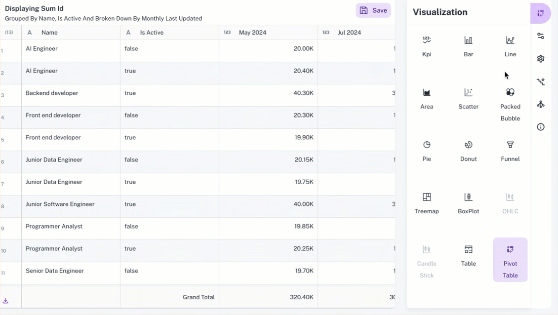
Item Description General Set general details. Title Edit the title of the chart. Subtitle Edit the subtitle of the chart. Help message Type the message that appears when you hover over the help icon. Display Set the display details of the table. View Type Select the view type: - Flat view is the regular pivot table view.
- - Tree view. Refer to Tree view for more details.
Density Specify the density of each row. The following options are available: Short, Medium, Tall, and Extra Tall. Normal/Zebra Row Choose whether to maintain normal rows or Zebra rows in a table, which are alternating shades of color applied to the rows. Heatmap Enable Heatmap and choose the right scaling method to highlight patterns and reveal insights in your pivot table data. You can also define color stops to create a gradient that visually represents your data values. Each stop specifies a color at a specific position (0-100%) in the range. Number Notation Choose an option from the Numeric Notions to select how numerical values are displayed: - Auto: The system automatically determines the most appropriate notation (standard, thousands, millions) based on the magnitude of the data.
- Thousands (K): Displays values in thousands, abbreviated with K (e.g., 10,000 becomes 10K).
- Millions (M): Displays values in millions, abbreviated with M (e.g., 1,000,000 becomes 1M).
Decimal Specify the number of digits to display after the decimal point. Linked reports Set the details of the dashboard reports you want to view from this widget. Linked report URL Paste the URL of the dashboard that you want to view from this widget. Open in New tab Specify if you want to view the linked report in a different tab.
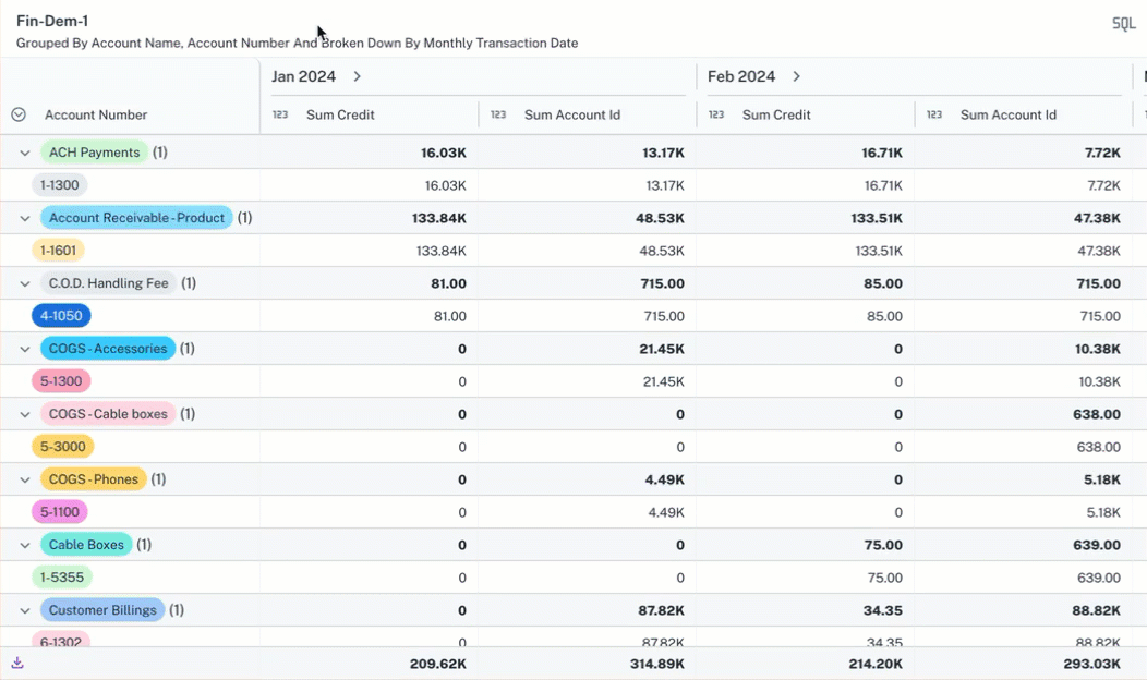
Pivot table - Tree view
The Tree view in the Pivot table of a widget offers a hierarchical representation of data, opposed to the Flat view, which presents data in a standard table format. Here are the key features of the Tree view in a pivot table
-
Hierarchical Structure
-
The tree view allows users to group data into nested categories, showing relationships between different data points. For example, it can display sales data grouped by currency, and then further broken down by credit card type within each currency.
-
This provides a drill-down capability, allowing users to explore data at different levels of detail.
-
-
Subtotal Calculations:
-
The tree view automatically calculates subtotals for each level of the hierarchy. These subtotals provide aggregated values for the grouped data, making it easier to understand overall trends and patterns.
-
For example, the sum of all transactions for a specific credit card type within a specific currency is shown as a subtotal.
-
-
Flexibility and Customization:
-
Users can rearrange rows and columns to change the grouping and aggregation of data, providing flexibility in how they analyze the information. The user can change the location of the data fields, moving them from row to column and vice versa.
-
Options like Density (how small the cells appear), Zebra (alternate row highlighting), and Numeric representation (displaying values in thousands, millions, or auto) allow for visual customization.
-
Adding multiple columns or complex groupings can lead to performance issues or errors.
Setting the Tree view for pivot table
-
From a widget, click the Change Visualization/Widget Type button and select Pivot table.
-
Click Update settings button, set the following in the Settings box and click Apply.
Field Description Display View Type Select Tree View. Density Specifies the desired cell size. Lower density values result in smaller, more detailed cells. Normal/Zebra Rows Applies alternating background colors to rows or columns, creating a zebra stripe effect to enhance visual distinction. Number Numeric Notations Display values in thousands (K), millions (M), or automatically. Decimal Points Specifies the decimal point. 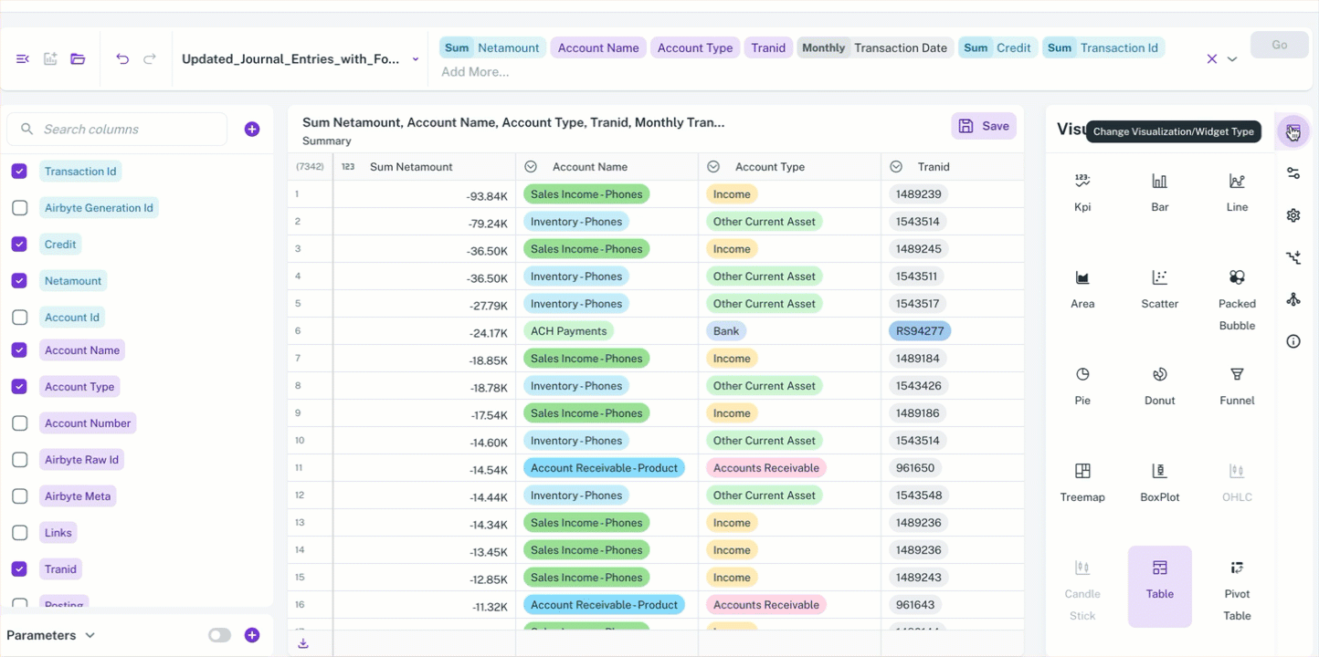
You can rearrange rows and columns to control how your data is grouped and aggregated, providing you with maximum flexibility for analysis. You can also manipulate the location of data fields, switching them between rows and columns as needed.
Was this helpful?