Create a visualization or widget
-
On the Home page, from the left navigation panel, click Workspace and from the list of workspaces, select a workspace from where you want to visualize data.
-
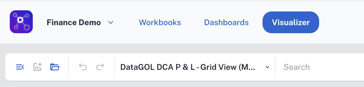
From the top, click Visualizer.
-
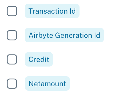
From the drop-down on top, choose a specific workbook containing the data you wish to visualize. All the columns of the workbook are listed in the left navigation panel. The columns are listed with color codes:
-
Blue: These columns contain numerical data that can be aggregated by summing their values.
-
Purple: These columns contain data, either numerical or textual, that are not suitable for summation or similar mathematical aggregation.

-
Grey: These columns contain date and time-based data.

-
-
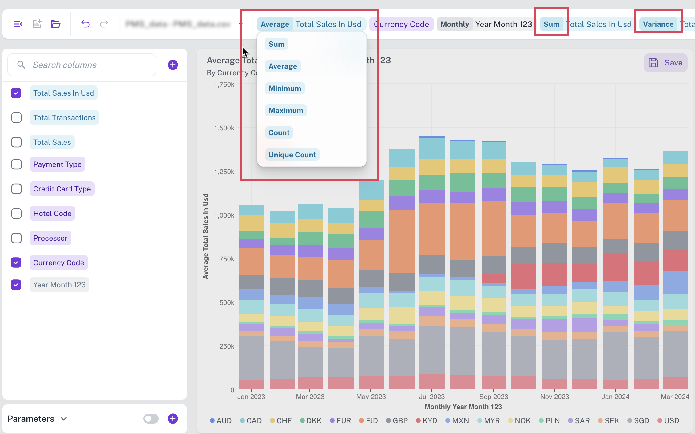
Choose the columns containing the data you want to visualize. These columns are listed horizontally on the top.
-
From the upper right side, choose the appropriate aggregation functions for each columns. Refer to Aggregate functions for more details.
-
Click Create Now or also click GO from top. The most appropriate visualization widget for your selected data is displayed on the canvas.
-
From the right of the page you have multiple edit options.
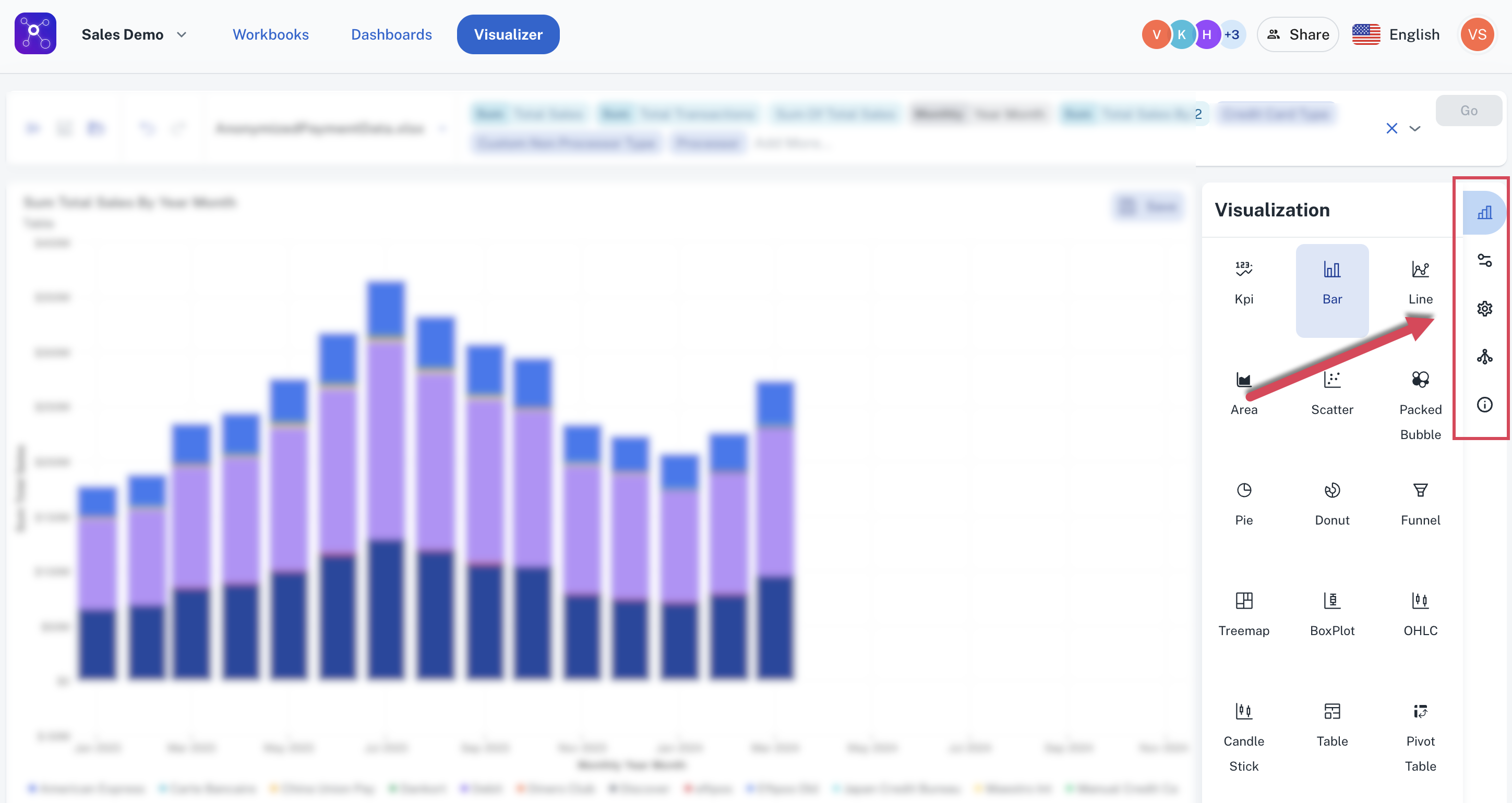
Click the any of following icons to:
-
Change the visualization/widget type. Click the Change Visualization/ Widget type icon get this done.
-
Edit the configurations of the current widget. To do this click the Update Widget Column Configurations icon.

-
Edit the settings of the current widget. To do this click the Update settings icon.

-
Choose drill down options to drill down the data. To do this click the Drill Down icon.

-
View SQL query of the data visualization details. To do this, click the View Data Details icon.

-
-
Ensure to save the widget to a Dashboard. Refer to creating a dashboard.