Widget types
DataGOL provides a diverse selection of data visualization widgets, enabling users to represent information graphically for effective analysis and interpretation across a wide range of data visualization requirements. The following types are of widgets are included in DataGOL.
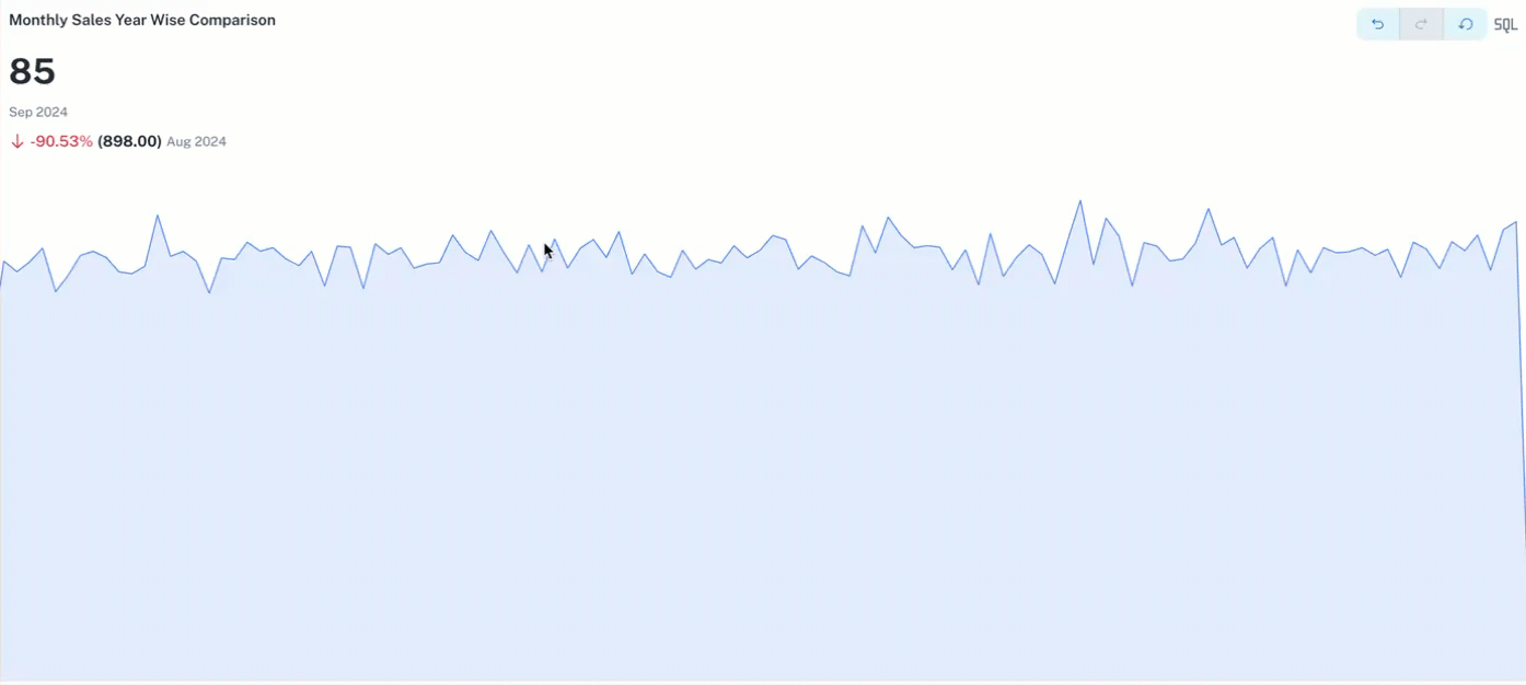
KPI
KPI widgets in the Visualizer display key performance indicators as single, easily digestible numbers with accompanying context or trend indicators in time series.
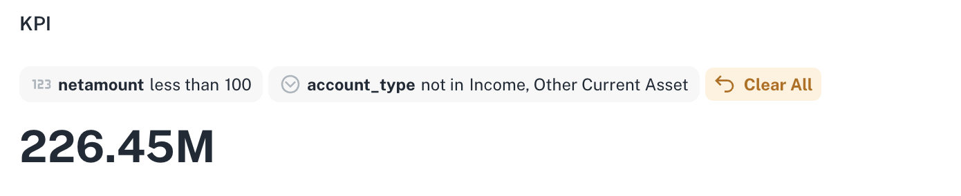
A time series plot or Spark line is also displayed in the KPI widget in DataGOL that provide the trends in KPI over a time period.
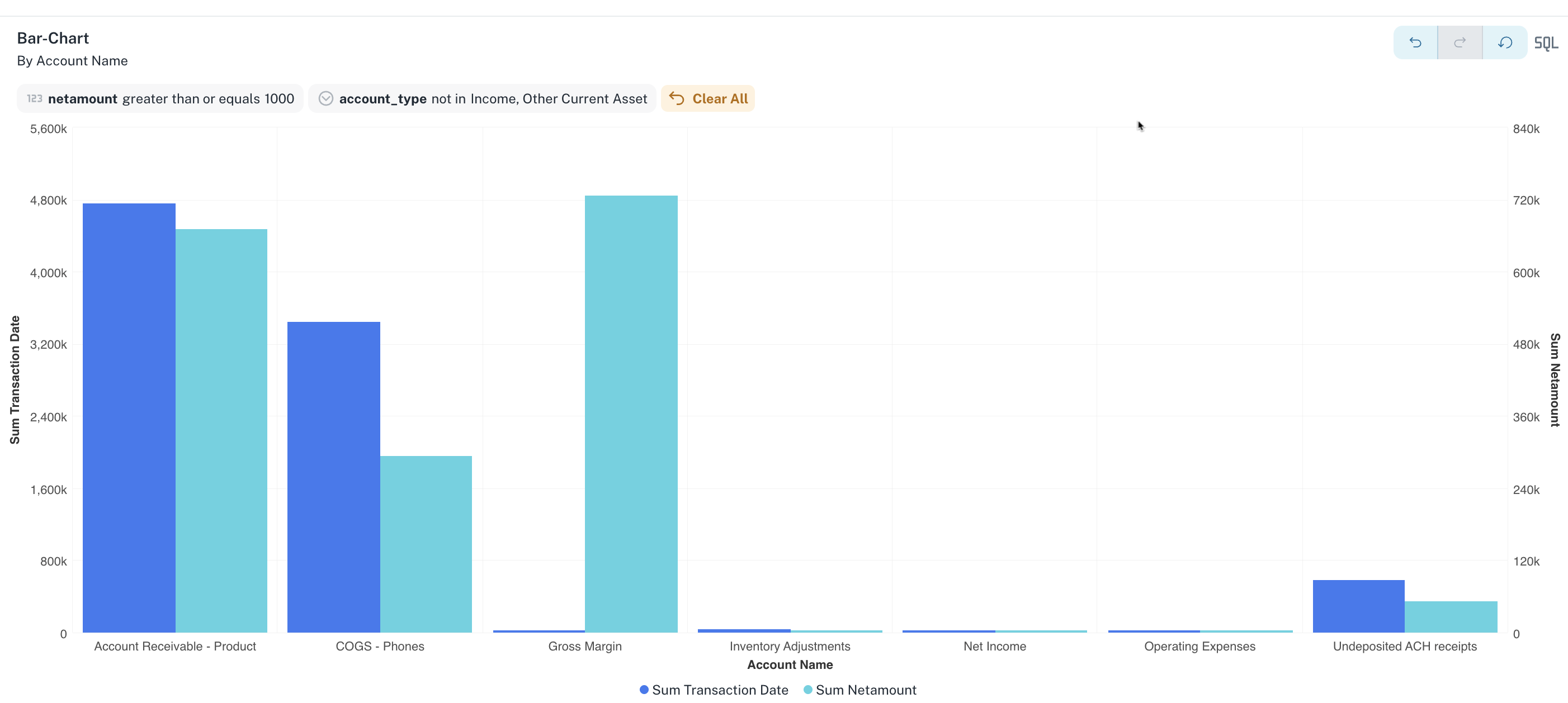
Bar
A bar chart uses rectangular bars of varying heights or lengths to represent the values of different categories, making it easy to compare quantities at a glance.
Line
Line chart widgets connect data points with lines to effectively illustrate trends and changes in values over a continuous interval like time. They excel at showing how data evolves and comparing the progression of multiple datasets simultaneously.
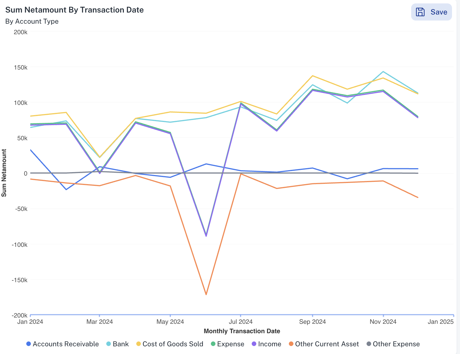
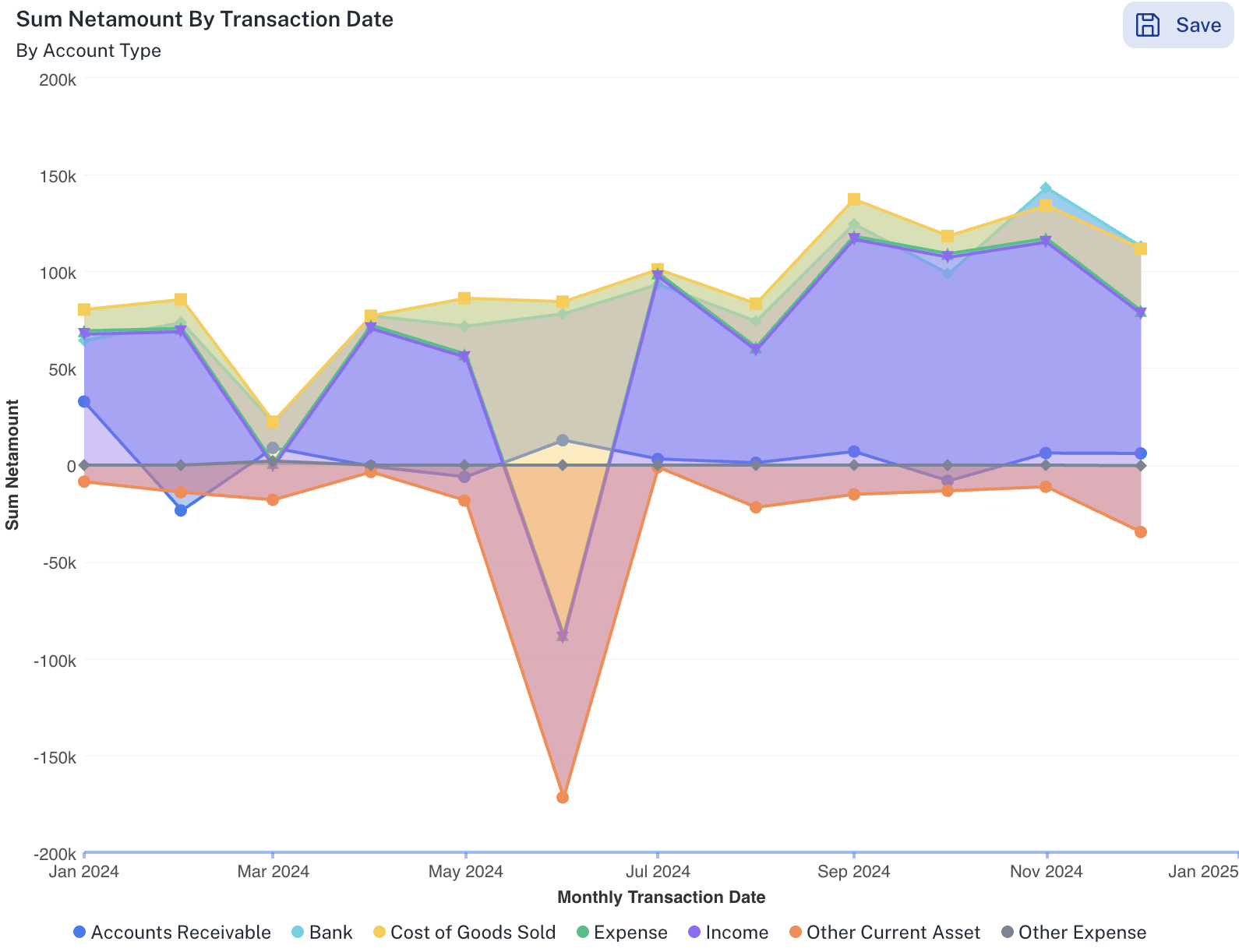
Area
Area chart widget are similar to line chart widgets but fill the space between the line and the axis with color, emphasizing the magnitude of the values and their cumulative impact over a continuous range. They are effective for showing the contribution of different components to a total over time.
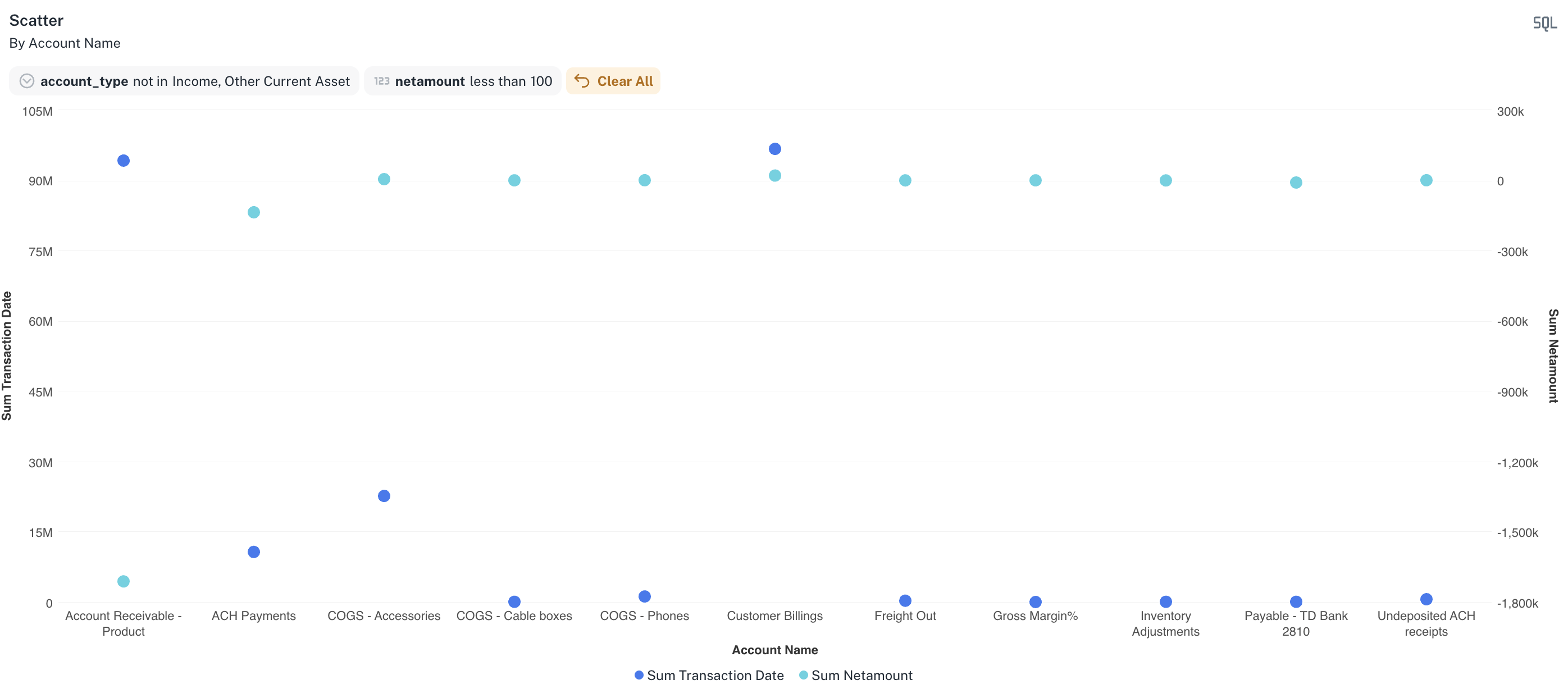
Scatter
Scatter charts display individual data points as dots on a graph to visualize the relationship between two different variables. By examining the pattern of these points, you can identify potential correlations, clusters, or outliers in your data.
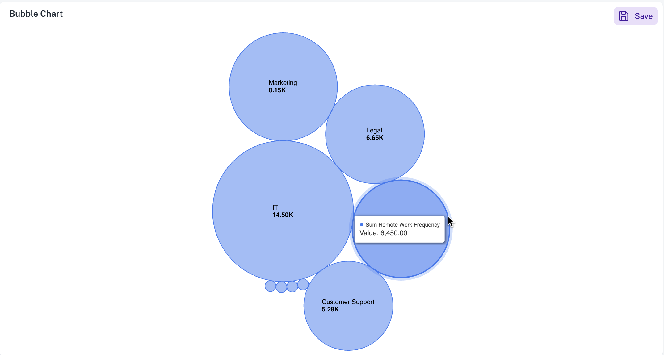
Packed Bubble
Packed bubble chart widgets display data as circles, where the size of each circle represents its value, and the circles are tightly packed together. This visually engaging chart widget is useful for comparing the relative sizes of numerous categories in a confined space.
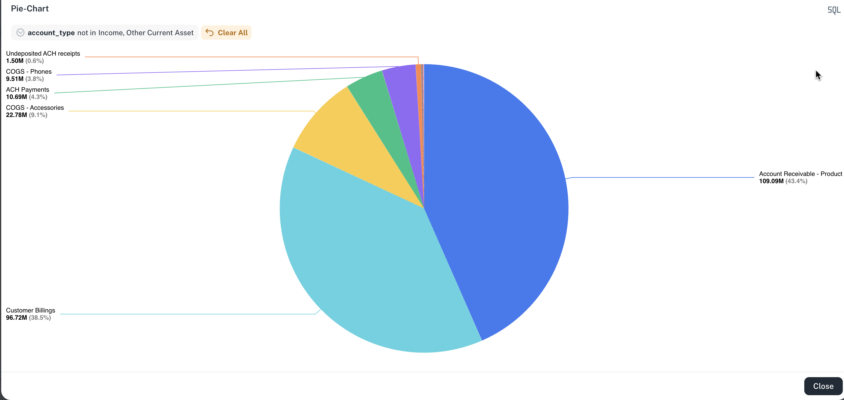
Pie
Pie chart widgets are circular graphs divided into slices, where each slice represents a proportion of a whole, making it easy to visualize the relative contribution of different categories. However, they can become cluttered and difficult to interpret when displaying a large number of small categories.
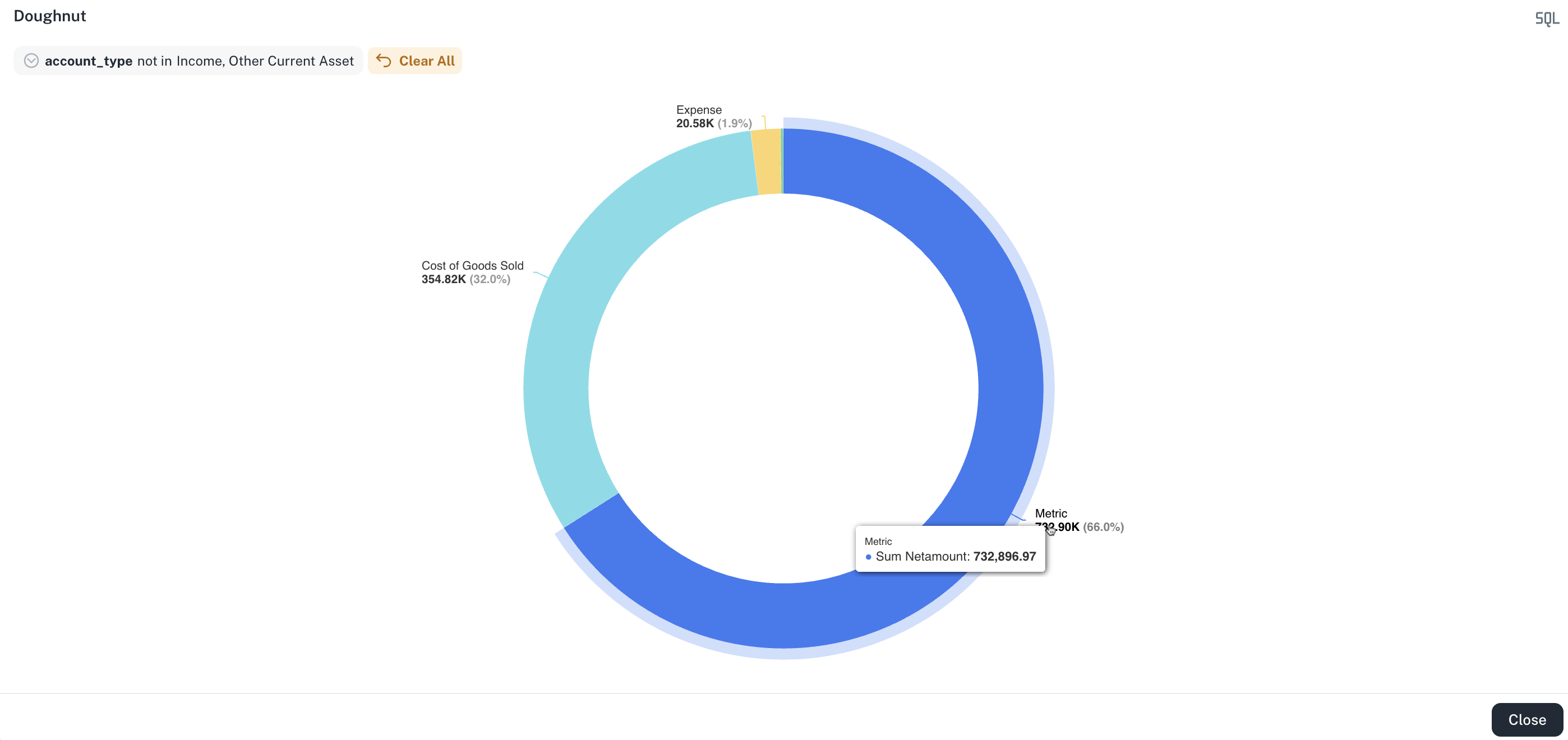
Donut
Donut chart is a variant of a pie chart with a hollow center, used to represent parts of a whole. Each segment of the ring shows the relative proportion of a category, Donut charts offer a cleaner design and improved space utilization, making them well-suited for dashboards and visual summaries.
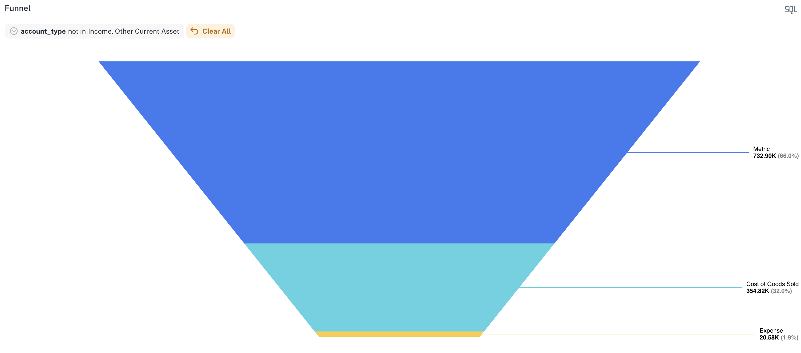
Funnel
Funnel chart widgets display data that progresses through a series of stages, with each stage represented by a progressively smaller section, resembling a funnel. They are commonly used to visualize processes like sales pipelines or user flows, highlighting potential drop-off points at each stage.
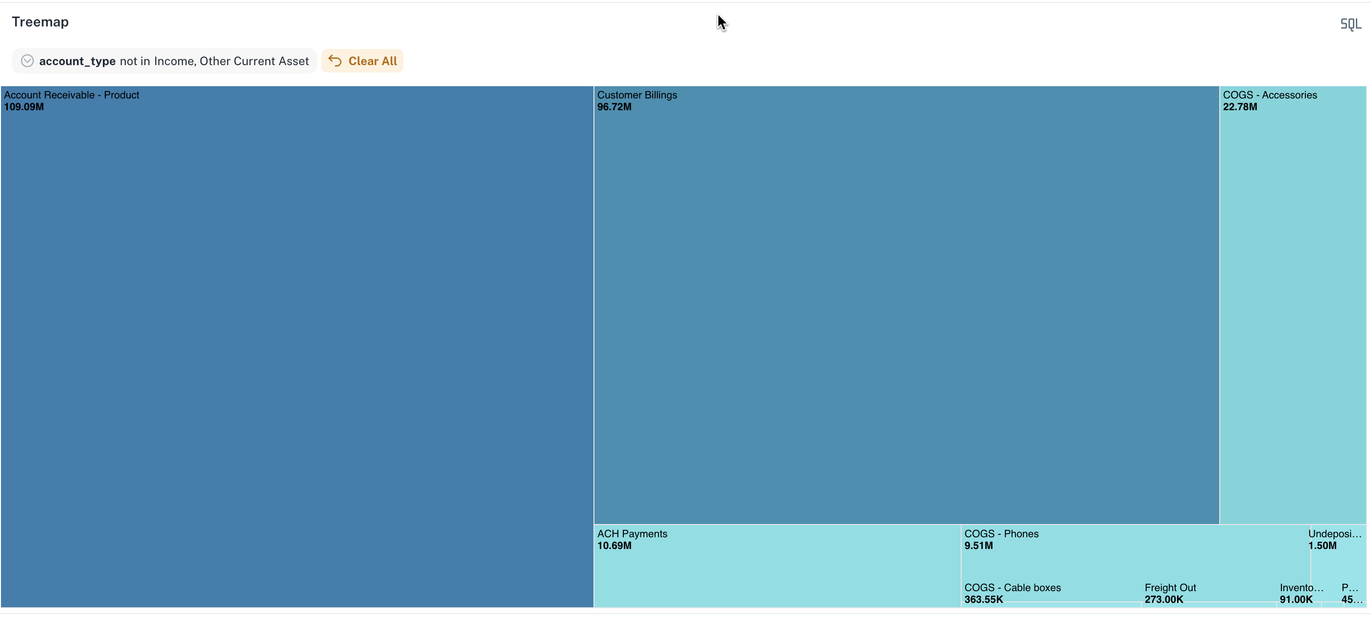
Tree map
Tree map chart widgets display hierarchical data as a set of nested rectangles, where the size and color of each rectangle correspond to its value and category within the hierarchy. This provides a visually effective way to understand the proportions and relationships within complex, multi-level data.
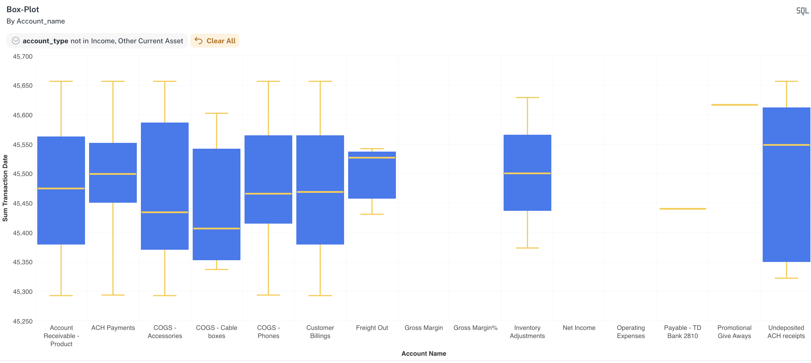
Box plot
Box plots, also known as box-and-whisker plots, provide a standardized way of displaying the distribution of data based on a five-number summary: minimum, first quartile, median, third quartile, and maximum. The box represents the interquartile range (IQR), while the whiskers extend to show the spread of the data, highlighting potential outliers.
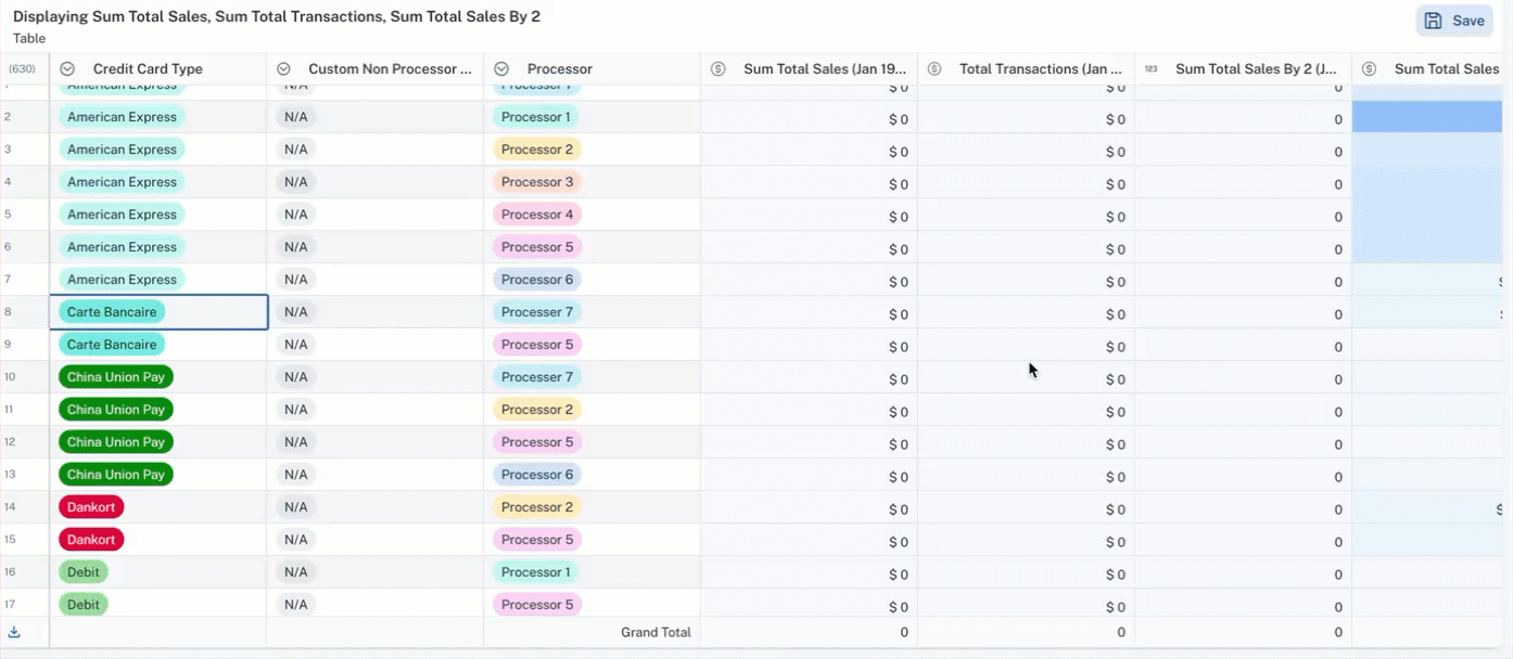
Tables
Tables present raw data in an organized, row-and-column format, allowing for precise reading of individual values. While not graphical, they are fundamental for displaying detailed information and enabling direct comparisons across different data points.
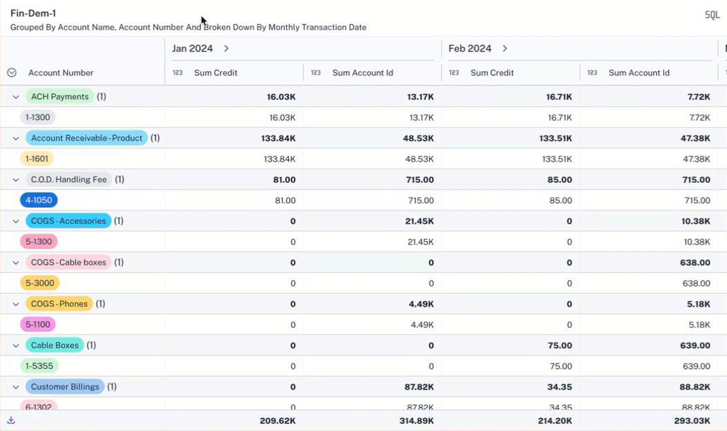
Pivot tables
Pivot tables are powerful data summarization and analysis tools that allow you to reorganize and aggregate data from a table into a more meaningful format. By selecting different rows, columns, and values, you can quickly extract insights and identify patterns within large datasets without altering the original data.
Pivot tables with Tree view
A tree view in a pivot table allows you to display hierarchical data in a collapsible, tree-like structure within the row or column labels, making it easier to navigate and analyze different levels of categorization. This enables you to drill down into specific branches of the hierarchy to examine the underlying data or collapse levels for a high-level summary.
Also see: