Widget types
Widgets provide a wide range of data visualization options within our business intelligence (BI) tool. By combining different data columns with a variety of widgets, business users can uncover valuable insights. Our system provides visualization suggestions based on your data, helping you understand which visualizations are best suited for your dimensions, metrics, and time-based information.
The following widgets are supported in DataGOL:
KPI widget
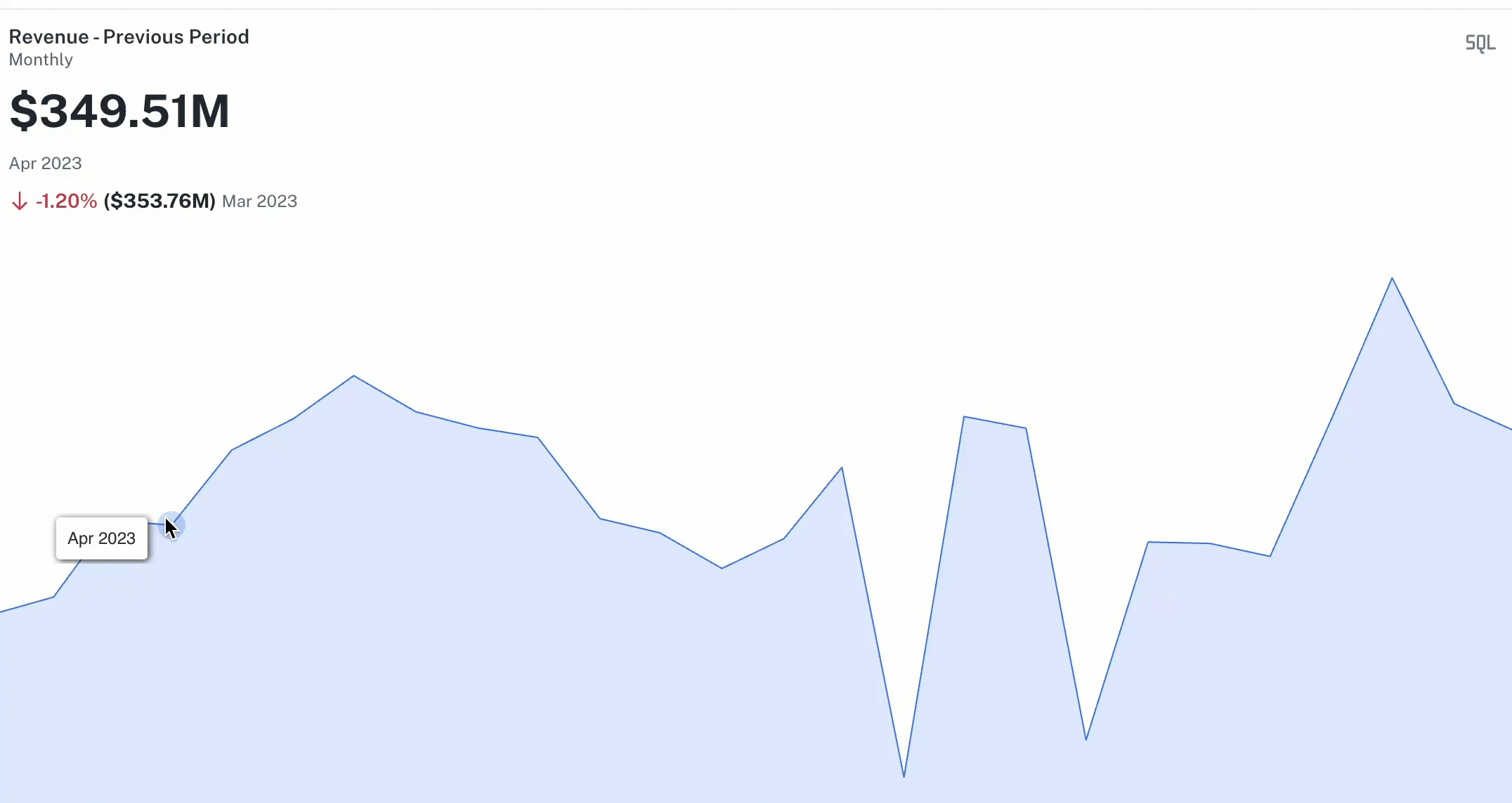
Purpose: To display a single, crucial metric, often with a comparison or trend indication.
Data combinations and user achievements for KPI widget
-
1 Metric (1M)
-
Achieve: Display a single, important aggregated value (e.g., total current sales).
-
Key capabilities: Highlight a key performance figure, change metric aggregation.

-
-
1 Metric, 1 Date Time (Truncated) (1M 1DTT)
-
Achieve: Show a key metric's value in context of a time period, potentially showing change or trend (e.g., current month's revenue vs. last month).
-
Key capabilities: View metric for a selected time bucket (monthly, yearly, etc.), apply filters.
-
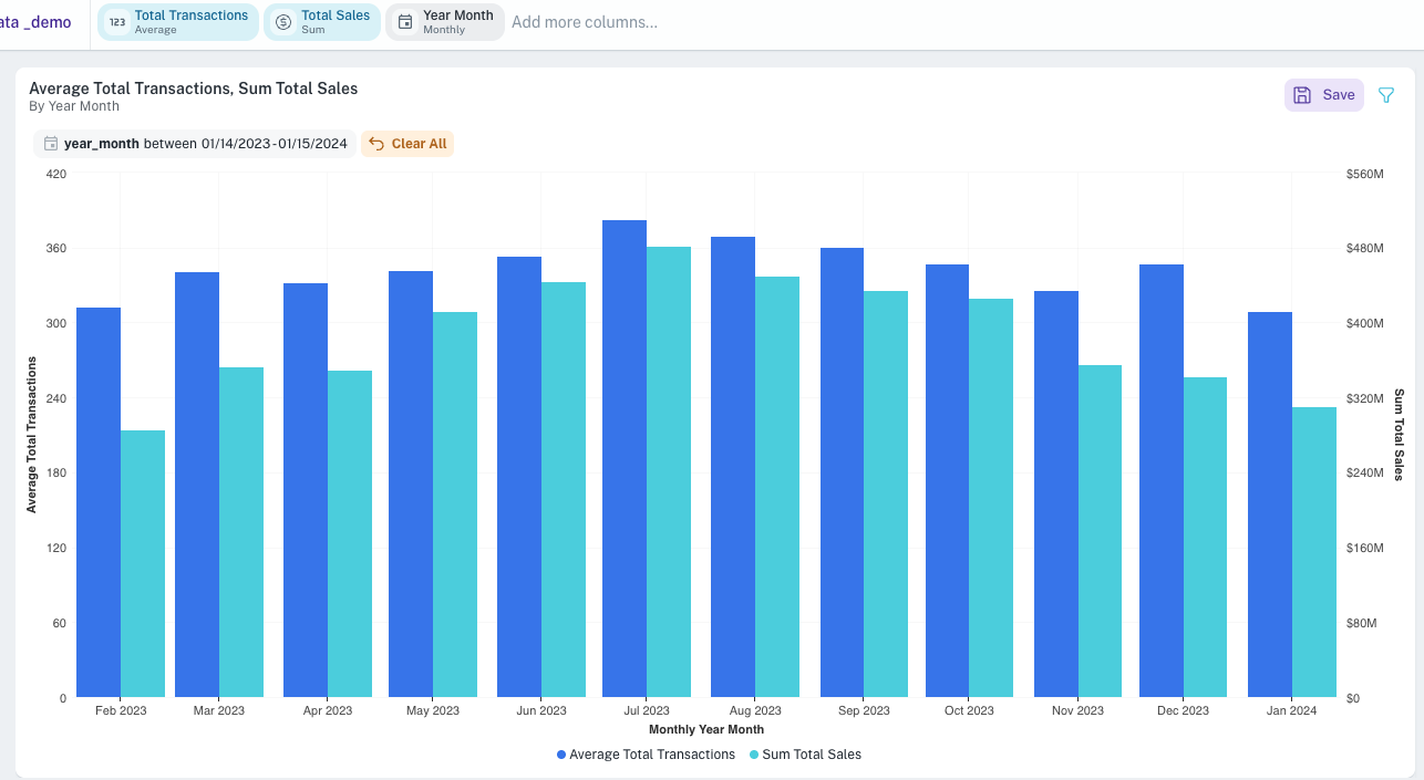
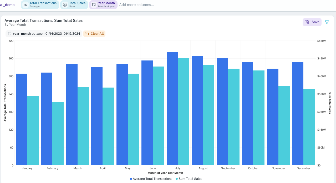
Bar chart widget
Purpose: Ideal for comparing values across different categories or tracking changes over discrete time periods.
Data combinations and user achievements for Bar chart
-
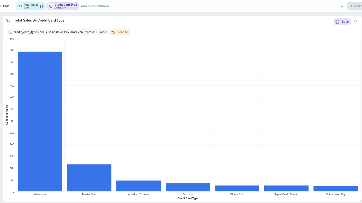
1 Dimension, 1 Metric (1D 1M)
-
Achieve: Compare a metric's value across different categories (e.g., sales per product). Identify top/bottom performers.
-
Key capabilities: Visualize magnitude differences, apply percentage stacking to see contribution to total, drill down for details.
-
-
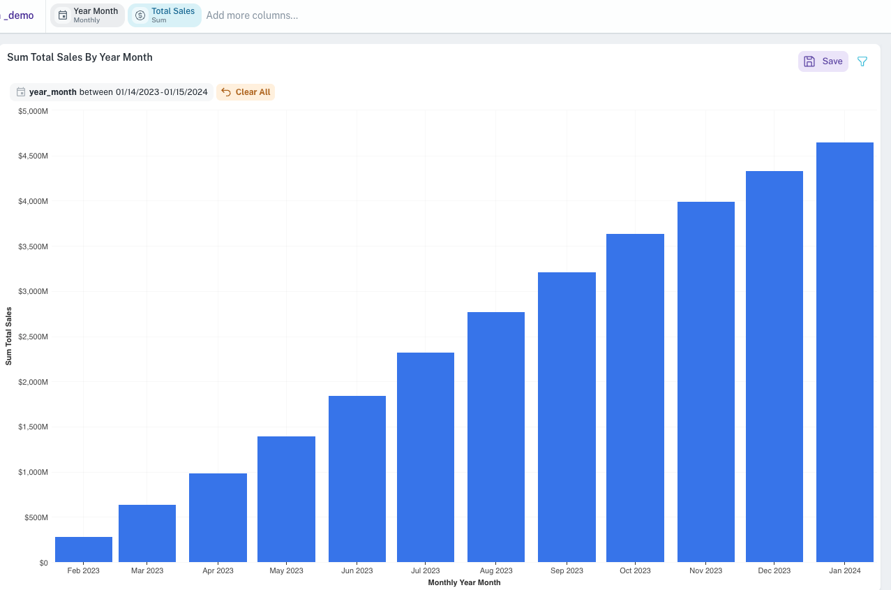
1 Metric, 1 Date Time (Truncated) (1M 1DTT)
-
Achieve: Track a single metric's trend over time (e.g., monthly revenue). Spot increases, decreases, or plateaus.
-
Key capabilities: Observe performance over selected time periods, change metric aggregation (sum, average, count), drill down.
-
-
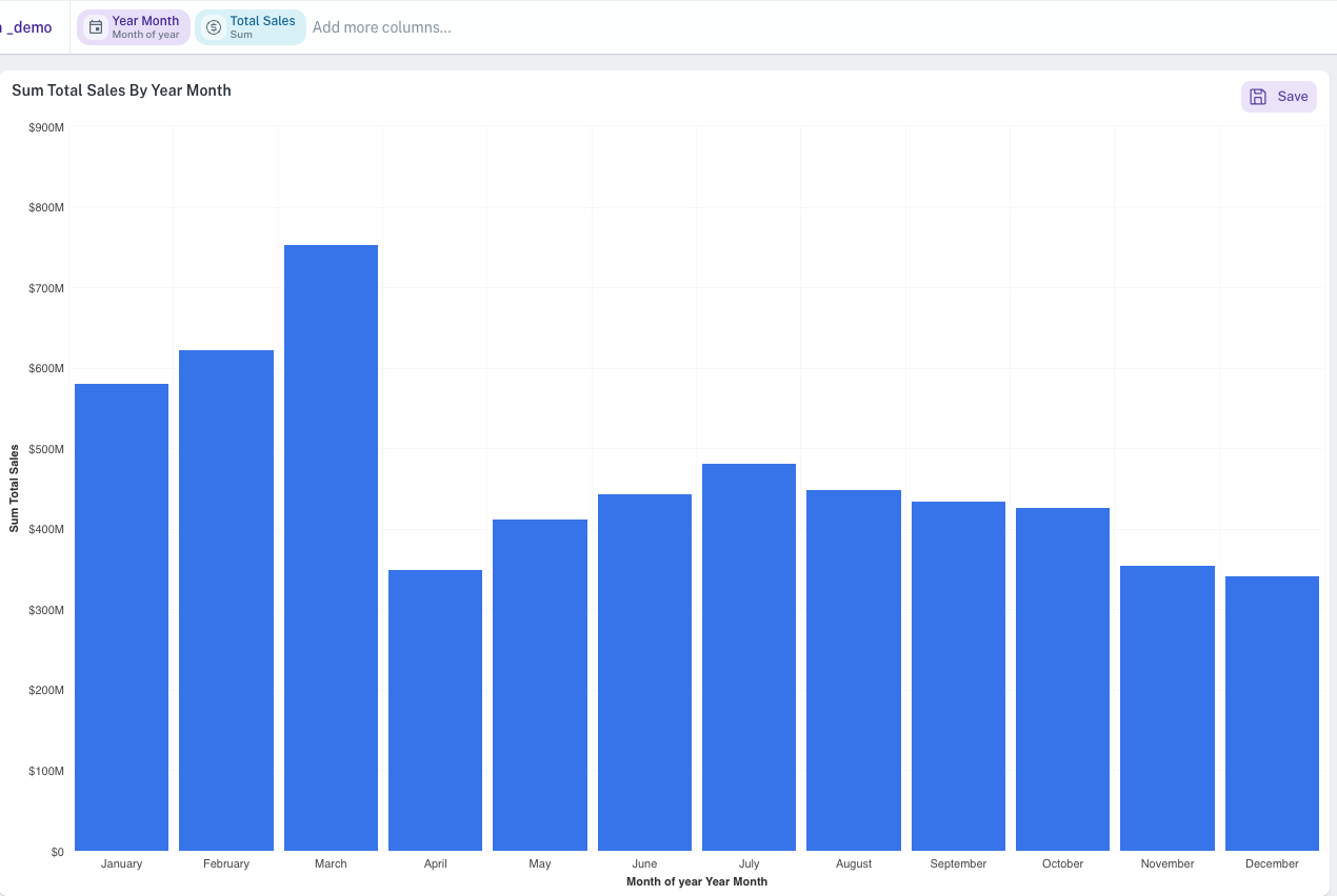
1 Metric, 1 Date Time (Part) (1M 1DTP)
-
Achieve: Analyze a metric based on recurring date parts (e.g., average sales by day of the week across multiple weeks). Identify cyclical patterns.
-
Key capabilities: See performance by specific time segments (hour, day of week, month of year), change metric aggregation, drill down.
-
-
Multiple Metrics, 1 Date Time (Truncated) (MM 1DTT)
-
Achieve: Compare trends of several different metrics over the same time periods (e.g., compare sales and profit growth month-over-month).
-
Key capabilities: Visualize multiple metric trends simultaneously, change chart type for individual metrics (e.g., one bar, one line), merge axes for comparison, drill down.
-
-
Multiple Metrics, 1 Date Time (Part) (MM 1DTP)
-
Achieve: Compare multiple metrics based on recurring date parts (e.g., units sold vs. site visits by hour of day).
-
Key capabilities: Analyze correlations between metrics across time segments, change chart type for individual metrics, merge axes, drill down.
-
-
1 Metric, 1 Date Time (Truncated), 1 Date Time (Part) (1M 1DTT 1DTP)
-
Achieve: Perform a two-level time analysis (e.g., sales per quarter, further broken down by month of the year).
-
Key capabilities: Group by a primary time unit and then sub-group by a date part, apply stacking (normal/percent).
-
-
1 Dimension, 1 Date Time (Truncated), 1 Metric (1D 1DTT 1M)
-
Achieve: See how a metric performs for different categories over time (e.g., sales by region, per quarter).
-
Key capabilities: Group by dimension and then by time (or vice-versa), apply percentage stacking, drill down.
-
-
1 Dimension, 1 Date Time (Part), 1 Metric (1D 1DTP 1M)
-
Achieve: Analyze a metric for different categories based on recurring date parts (e.g., website traffic by source, per day of the week).
-
Key capabilities: Group by dimension and then by date part (or vice-versa), apply percentage stacking, drill down.
-
-
2 Dimensions, 1 Metric (2D 1M)
-
Achieve: Compare a metric across two different categorical groupings (e.g., sales by product category, further broken down by customer segment).
-
Key capabilities: Create stacked or grouped bars based on a second dimension, apply percentage stacking, drill down.
-
-
Multiple Metrics, 1 Dimension (MM 1D)
-
Achieve: Compare several different metrics for each category in a dimension (e.g., for each product, show sales, profit, and quantity sold).
-
Key capabilities: Visualize multiple performance aspects per category, merge axes, change chart types for individual metrics, drill down.
-
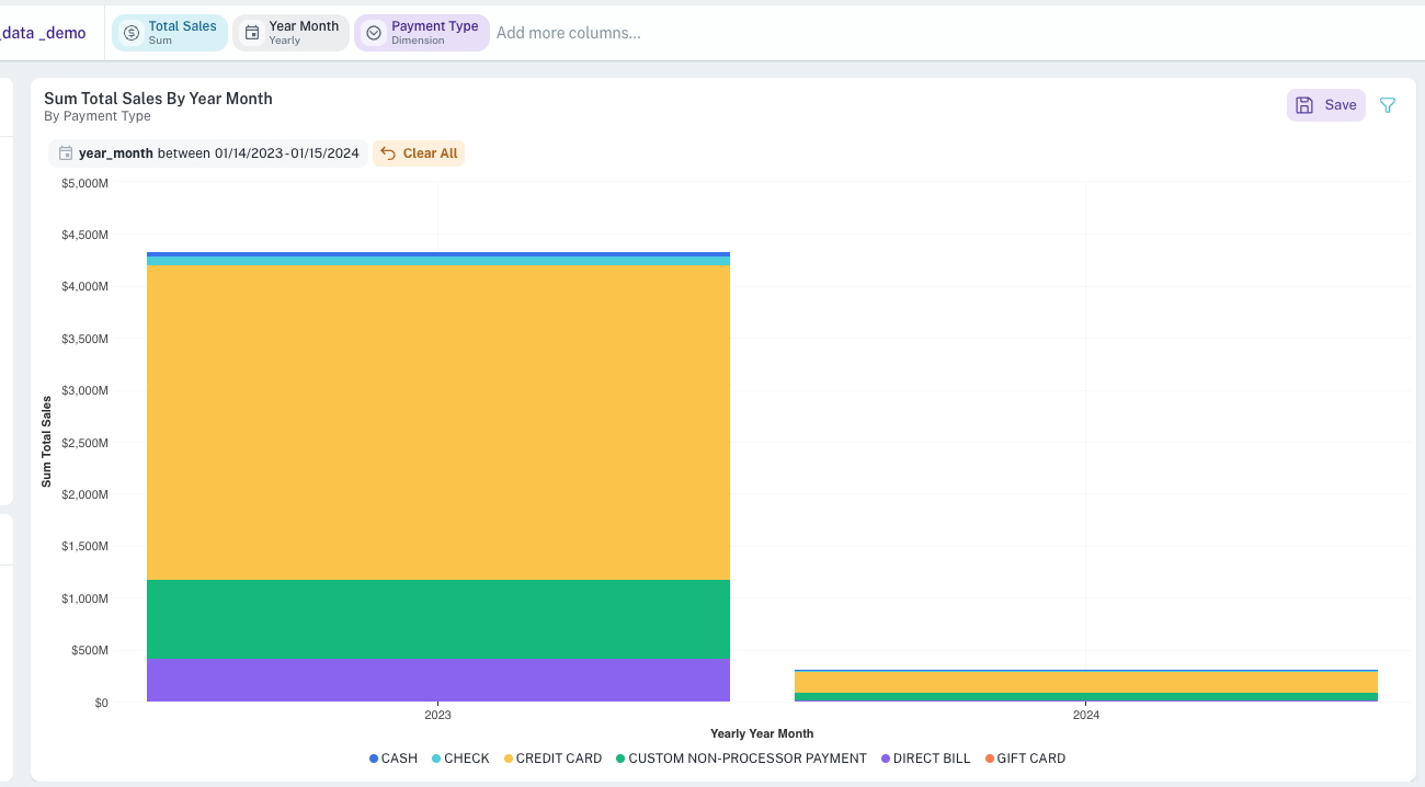
Line/Area/Scatter chart widgets
Purpose:
-
Line/Area: Visualizing trends over continuous data (especially time). Area charts emphasize volume or magnitude over time.
-
Scatter: Showing relationships and distributions between two or three numerical variables.
Data combinations and user achievements for Line/Area/Scatter chart
-
1 Dimension, 1 Metric (1D 1M)
-
Achieve: Plot a metric against distinct, ordered categories to see progression or comparison (e.g., customer satisfaction score by survey version).
-
Key capabilities: Visualize trends across categorical stages, drill down.
-
-
1 Metric, 1 Date Time (Truncated) (1M 1DTT)
-
Achieve: Classic trend analysis showing a metric's performance over time (e.g., daily website visitors).
-
Key capabilities: Identify trends, seasonality, anomalies over time, change metric aggregation, drill down.
-
-
1 Metric, 1 Date Time (Part) (1M 1DTP)
-
Achieve: Analyze metric patterns based on recurring date parts (e.g., average transaction value by hour of day).
-
Key capabilities: Spot cyclical behavior, change metric aggregation, drill down.
-
-
Multiple Metrics, 1 Date Time (Truncated) (MM 1DTT)
-
Achieve: Compare the trends of multiple metrics over the same time periods (e.g., stock price vs. trading volume).
-
Key capabilities: Correlate metric movements, change chart type per metric, drill down.
-
-
Multiple Metrics, 1 Date Time (Part) (MM 1DTP)
-
Achieve: Compare multiple metrics based on recurring date parts (e.g., number of errors vs. system load by hour).
-
Key capabilities: Analyze relationships across cyclical time segments, change chart type per metric, drill down.
-
-
1 Metric, 1 Date Time (Part), 1 Date Time (Truncated) (1M 1DTP 1DTT)
-
Achieve: Analyze a metric with one time aspect on the axis and another for series grouping (e.g., daily sales trend, with separate lines for each month of the year).
-
Key capabilities: Explore complex time-based interactions, drill down.
-
-
1 Metric, 1 Date Time (Truncated), 1 Dimension (1M 1DTT 1D)
-
Achieve: Track a metric's trend over time, with separate lines/series for each category in a dimension (e.g., monthly sales trends for different product lines).
-
Key capabilities: Compare trends across categories, drill down.
-
-
1 Metric, 1 Date Time (Part), 1 Dimension (1M 1DTP 1D)
-
Achieve: Analyze a metric based on a date part, with separate lines/series for categories (e.g., average call duration by day of week, for different support teams).
-
Key capabilities: Compare cyclical patterns across categories, drill down.
-
-
1 Metric, 2 Dimensions (1M 2D)
-
Achieve: Plot a metric with one dimension on the axis and another for creating separate series/lines (e.g., project completion rate by phase, with separate lines for different project managers).
-
Key capabilities: Explore multi-dimensional relationships, drill down.
-
-
Multiple Metrics, 1 Dimension (MM 1D)
-
Achieve: Plot multiple metrics against categories of a single dimension (e.g., for each marketing campaign, plot cost, clicks, and conversions).
-
Key capabilities: Compare performance of different metrics across categories, merge Y-axes, drill down.
-
-
Scatter Plot Specific: 2 Metrics (2M) (Potentially +1D or +1M for color/size)
-
Achieve: Identify correlation or distribution patterns between two numerical variables (e.g., advertising spend vs. sales). A third dimension or metric can add more context through point color or size.
-
Key capabilities: Visualize relationships, detect outliers, cluster data points.
-
Packed Bubble chart widget
-
Purpose: Displays data as a cluster of circles, where circle size and/or color represent metrics/dimensions.
-
Achieve: Compare relative values or concentrations quickly, identify dominant categories. Good for showing many values without axes.
Pie/Donut/Funnel chart widget
Purpose:
-
Pie/Donut: Showing proportions of a whole.
-
Funnel: Representing stages in a process and drop-offs.
Data combinations and user achievements for Pie/Donut/Funnel chart
-
1 Dimension, 1 Metric (1D 1M)
-
Achieve: Understand the contribution of each category to a total (e.g., market share by company for Pie/Donut; lead conversion rate at each sales stage for Funnel).
-
Key capabilities: Visualize part-to-whole relationships, drill down.
-
-
1 Date Time (Part), 1 Metric (1DTP 1M)
-
Achieve: Show how a metric is proportionally distributed across different date parts (e.g., percentage of sales by quarter of the year).
-
Key capabilities: Analyze proportional distribution over cyclical time segments, drill down.
-
Treemap widget
-
Purpose: Visualizes hierarchical data as a set of nested rectangles. Size and color can represent different metrics.
-
Achieve: Understand part-to-whole relationships within a hierarchy (e.g., sales by product category, then sub-category, then product).
Boxplot widget
-
Purpose: Shows the distribution of numerical data through quartiles, median, and outliers.
-
Achieve: Compare distributions of a metric across different categories (e.g., compare salary distributions across different departments). Identify spread, skewness, and outliers.
Table widget
Purpose: Displaying detailed data in a structured row-and-column format for lookups and precise comparisons.
Data combinations and user achievements for Table widget
-
1 Dimension, 1 Metric (1D 1M)
-
Achieve: View a list of categories with their corresponding metric values.
-
Key capabilities: Simple data lookup, sorting.
-
-
1 Date Time (Truncated), 1 Metric (1DTT 1M)
-
Achieve: See a metric's value for each defined time period.
-
Key capabilities: Time-based data lookup, sorting.
-
-
Multiple Dimensions, Multiple Metrics (MD MM)
-
Achieve: Create a comprehensive data view with various attributes and measures.
-
Key capabilities: Detailed data exploration, reorder columns, sort by multiple columns.
-
-
Multiple Dimensions, Multiple Metrics, Multiple Date Time fields (MD MM MDT)
-
Achieve: Build a highly detailed report combining categorical, numerical, and various time-based data.
-
Key capabilities: Comprehensive reporting, column reordering, sorting, unit conversion display.
-
Pivot table widget
Purpose: Dynamically reorganize and summarize data for multi-dimensional analysis. Users can "pivot" dimensions between rows and columns.
Common user achievements (across combinations):
-
Explore data from multiple perspectives by dragging and dropping fields into rows, columns, and values.
-
Summarize large datasets into a compact, meaningful format.
-
Identify trends and patterns across intersecting dimensions.
-
Analyze data with totals and subtotals for rows and columns.
-
Visually enhance data understanding with HeatMap mode.
Data combinations for Pivot table widget
-
2 Metrics, 1 Dimension (2M 1D)
- Achieve: Analyze two metrics for each category of a dimension (e.g., for each product, show total sales and average profit margin).
-
2 Dimensions, 1 Metric (2D 1M / 1M 2D)
- Achieve: Create a cross-tabulation showing a metric at the intersection of two dimensions (e.g., sales by region and product category).
-
2 Metrics, 1 Date Time (Part) (2M 1DTP)
- Achieve: Analyze two metrics based on a recurring date part (e.g., average order value and number of orders by day of the week).
-
2 Metrics, 1 Date Time (Truncated) (2M 1DTT)
- Achieve: Compare two metrics over specific time periods (e.g., marketing spend vs. new customers acquired, per month).
-
2 Metrics, 1 Date Time (Truncated), 1 Date Time (Part) (2M 1DTT 1DTP)
- Achieve: Perform complex time-based analysis of two metrics, using both truncated periods and date parts for rows/columns.
-
Multiple Metrics, Multiple Dimensions, Multiple Date Time fields (MM MD MDT)
- Achieve: Build highly flexible and custom summary reports by arranging any combination of available fields into rows, columns, and aggregated values.
-
1 Date Time (Part), 1 Metric (1DTP 1M)
Radial Chart widget
-
Purpose: Displays data values as concentric arcs emanating from a central point, where each arc represents a category and its length corresponds to the metric value.
-
Achieve: Compare multiple categories side by side in a compact, visually engaging format. Ideal for showing 3–10 categories on a single metric where a traditional bar chart feels too flat.
Radar Chart widget
-
Purpose: Plots data points across multiple axes radiating from a center point, with each axis representing a time period or category and the data points connected to form a polygon.
-
Achieve: Compare two or more series across several dimensions simultaneously. Useful for identifying outliers, imbalances, or seasonal patterns across KPIs, products, teams, or regions.
Sunburst Chart widget
-
Purpose: Visualizes hierarchical data as a series of concentric rings, where each ring represents a level of the hierarchy and arc size is proportional to the metric value.
-
Achieve: Explore multi-level hierarchies (e.g., Region → Category → Subcategory) with interactive drill-down. Ideal for understanding part-to-whole relationships at every level in a single view.
Cohort Analysis widget
-
Purpose: Groups users by a shared characteristic (typically their first-activity month) and tracks their behavior over subsequent time periods in a retention heatmap.
-
Achieve: Track user retention, identify drop-off patterns, and analyze how different cohorts engage over time. Color intensity makes it easy to spot trends across M0 through Mn intervals at a glance.
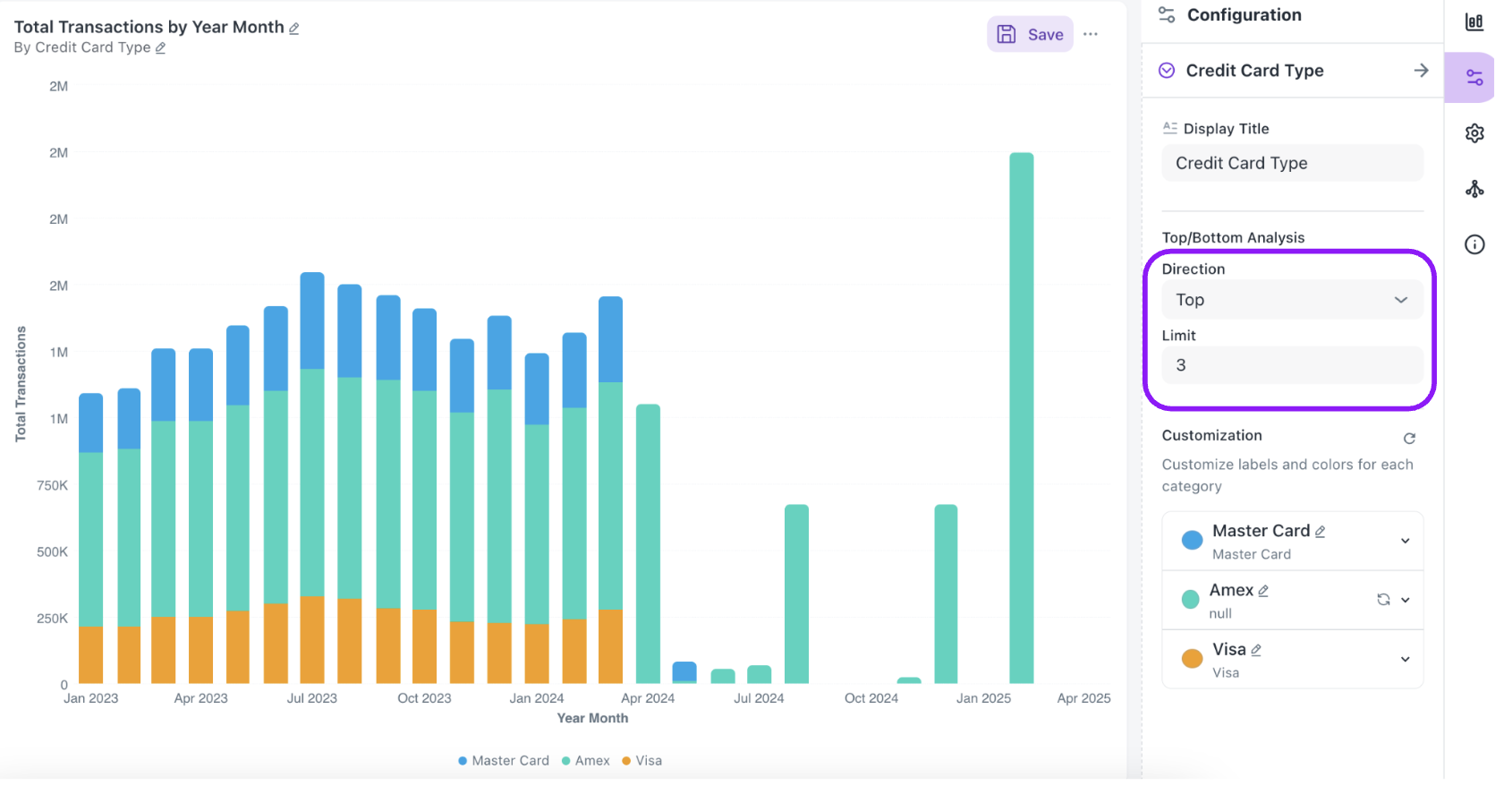
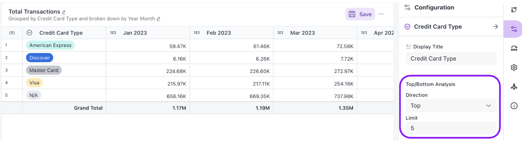
Top N / Bottom N Analysis
When working with grouped charts (bar, line, or area) or Pivot tables, you can now filter the visualization to display only the top or bottom N categories. This is configured directly from the Configuration panel without needing to modify your underlying data.
How to configure on Grouped Charts:
- Create or edit a grouped chart (e.g., a bar chart grouped by Payment Type).
- Open the Configuration panel on the right side of the editor.
- Locate the Top/Bottom Analysis section within the group-by dimension settings.
- Set the Direction to either Top or Bottom.
- Set the Limit to the number of categories you want to display (e.g., top 3).
You can also customize the display labels and colors for each category in the Customization section below the Top/Bottom controls.
How to configure on Pivot Table:
- Create or edit a Pivot table.
- Open the Configuration panel on the right side of the editor.
- Select the column on rows and locate the Top/Bottom Analysis section.
- Set the Direction to either Top or Bottom.
- Set the Limit to the number of categories you want to display (e.g., top 3).
Achieve: Summarize a metric based on different parts of a date (e.g., total units sold for each month of the year, across all years).
BI auto-visualization: Quick reference guide
This guide helps you understand what types of charts and widgets will be suggested based on the data columns you select, and how your data is typically arranged in those visualizations automatically.
Data column key
-
D: Dimension (e.g., Product Category, Region, Text)
-
M: Metric (e.g., Sales, Quantity, Numeric Value)
-
DT: Date Time (e.g., Order Date, Event Timestamp)
| If you select this data... | Suggested widget/chart types | How your data is typically used (If you pick this type) |
|---|---|---|
| 1+ Metric (M) | KPI, Gauge, Metrics | KPI/Gauge/Metrics: Your M (Metric) acts as the main value. If a DT (Date Time) is also chosen, it provides time context. |
| 1+ Dimension (D) OR 1+ Date Time (DT) | Bar, Line, Area, Scatter, Packed Bubble | Bar/Line/Area/Scatter/Packed Bubble: If DT is present: DT goes on the X-axis and M on the Y-axis. If a D is also present, it's used for grouping or as a series. If only D(s) are present: The first D goes on the X-axis, M on the Y-axis. The second D is used for grouping or as a series. |
| 1+ Dimension (D) | Pie, Donut, Funnel | Pie/Donut/Funnel: Your D defines the slices or segments, and M determines the size or value of each slice. |
| 1+ Dimension (D) AND 1+ Metric (M) | Treemap, Boxplot, Radial Chart | Treemap: D creates the hierarchy or rectangles, while M dictates the size or color of those rectangles. Boxplot: D establishes categories on the X-axis, and M represents the distribution on the Y-axis. Radial Chart: D defines the categories represented as concentric arcs, and M determines the arc length for each category. |
| 1+ Dimension (D) AND 1+ Metric (M) (multi-dimensional) | Radar Chart | Radar Chart: D defines the axes radiating from the center (e.g., Month, Category). M determines the value plotted on each axis. A second D in the Slice with Color field creates separate polygon layers per group. Multiple Ms can each generate their own polygon on the same chart. |
| 2+ Dimensions (D) (hierarchical) AND 1+ Metric (M) | Sunburst Chart | Sunburst Chart: Multiple Ds define the hierarchy levels from the innermost ring outward (e.g., Region → Category → Subcategory). M determines the arc size of each segment. Users can click segments to drill down through hierarchy levels. |
| 2 Date Times (DT) (Cohort Date + Activity Date) AND 1 Metric (M) (e.g., Retention %) | Cohort Analysis | Cohort Analysis: The first DT (Cohort Date) groups users by their first-activity period. The second DT (Activity Date) tracks subsequent activity. M (e.g., Retention Percentage) populates each cell of the heatmap. Rows represent cohorts and columns (M0, M1, M2…) represent time intervals since cohort entry. |
| Date Time (DT) AND 4+ Metrics (M) (or specific Open, High, Low, Close Metrics) | OHLC, Candlestick | OHLC/Candlestick: DT is placed on the X-axis (representing time). Your Ms are mapped to the Open, High, Low, and Close values. |
| 2+ Dimensions (D) (or specific From/To Dimensions) | Sankey, Dependency Wheel | Sankey/Dependency Wheel: The first D serves as the Source, and the second D as the Target. M indicates the flow or link value. |
| Geographic Dimension(s) (e.g., Country, State, Lat/Long) | Geo Map | Geo Map: Your geographic D defines the locations. M is often used for the size or color of map markers or regions. |
| 1+ Dimension (D) OR 1+ Date Time (DT) AND 1+ Metric (M) (allowed for pivot) | Pivot Table | Pivot Table: Generally, D and/or DT are used for Rows/Columns, and M for summarized Values (this offers flexible configuration). |
| Any Combination of Columns | Table | Table: All your selected columns are displayed as they are. |
General notes for auto-configuration
-
First column: When multiple columns of the same type are selected (e.g., two Metrics), the system often picks the "first" one by default for a primary role.
-
Default metric: If you select Dimensions or Date Times but no Metrics for some charts, a default Metric (like "Count of Rows") might be automatically used for the Y-axis.
-
Flexibility: This is a guide to automatic suggestions and initial setup. You can always customize the widget further once it's created.
-
Availability: Some advanced or specialized chart types may only be suggested if your data very specifically matches their requirements (e.g., stock data for Candlestick charts). Widgets/charts listed as "NOT_SUPPORTED" in the underlying code won't be auto-suggested or available.
Was this helpful?