Radial widget
Radial Chart
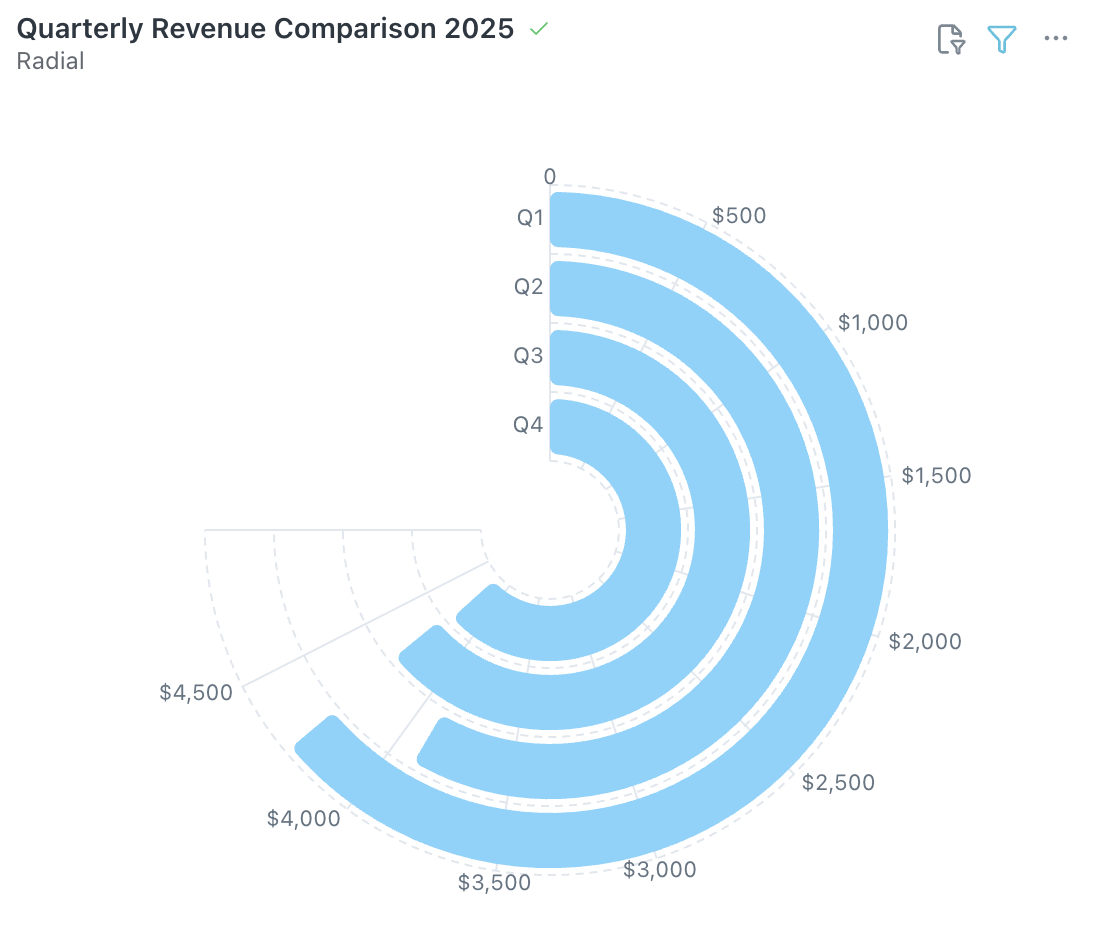
The Radial Chart displays data values as concentric arcs from a central point, ideal for comparing 3–10 categories on a single metric in a compact, visual format.
When to use: Comparing categories side by side or showing periodic performance where a bar chart feels too flat.
How to create:
- Open the Visualizer and select your dimension and metric columns.
- Choose Radial from the Visualization panel.
- Configure categories, values, and Slice with Color from the Configuration panel on the right.
Tip: Radial charts work best with fewer than 10 categories. For larger datasets, consider a bar chart or treemap instead.
Was this helpful?