Sunburst widget
Sunburst Chart
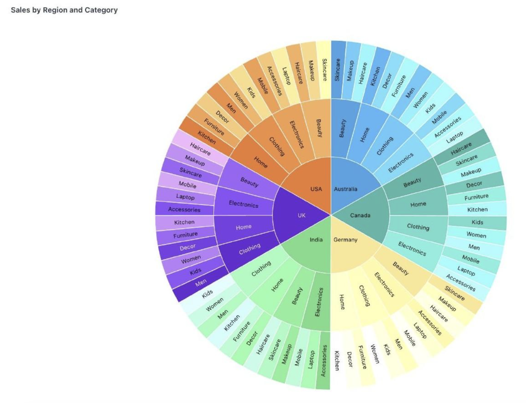
The Sunburst Chart visualizes hierarchical data as concentric rings, where each ring represents a level of the hierarchy and arc size reflects the metric value — ideal for exploring part-to-whole relationships across multiple levels in a single interactive view.
When to use: Exploring multi-level hierarchies (e.g., Region → Category → Subcategory), understanding part-to-whole relationships at every level, or building interactive dashboards with drill-down navigation.
How to create:
- Open the dashboard editor and add or edit a widget.
- Select your hierarchy columns (e.g., Country, Category, Subcategory) and a numeric value column.
- Choose Sunburst from the Visualization panel.
- In the Configuration panel, drag your dimension columns into the Hierarchy Levels section in the order you want them displayed — outermost to innermost (e.g., Country → Category → Subcategory).
- Set the Values field to the numeric metric that determines segment size (e.g., Sum of Number Quantity).
Drill-down navigation:
| Action | Result |
|---|---|
| Hover over a segment | Displays the segment's value |
| Click a segment | Zooms into that level of the hierarchy |
| Click breadcrumb trail | Jumps back to any level without stepping out one by one |
Tip: Use the breadcrumb navigation at the top of the chart to jump back to any level in the hierarchy instantly — no need to click out step by step.
Was this helpful?